In order to prepare for the magazine article I did some research into other article layouts and found these :
 This article layout I liked because it uses a main picture of what it is about and uses very simple boxes to seperate the other pictures and text, it isn't about a film, however I thought it was a good double page spread design as the focus is on the place.
 This double page spread if from an NME magazine, I like this because its obviously aimed at a younger generation, however I think it is quite cluttered and will take away some meaning to the love story article.
 This article I have used because it is an example of how an interview can be set out, however this is using the interviewee in the pictures where as the article about my short film will be plugging the film through the pictures and design used rather than the director who I have interviewed.
 I liked this article layout because its simple and effective the colours used add to the effect that it gives the reader and the uses of the bleakness draws you in to read the article unlike the NME layout that stood out and there was loads of things staring at you at once.
 I picked this article because it was another idea for showing steps or the interview questions through the use of different background colours however its almost babyish in the cartoon use and colours used, so I still prefer the simpleness of the last design.
I then designed some ideas of my own to incorporate the hearts and the paper incorporating the idea from the signs for our article, this also ties into the poster design that Sarah has made which uses the colour Red obviously symbolic of love and the paper heart.
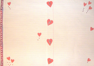
Instead of using the computer to make designs I decided to use my craft bits to come up with some ideas using paper and cutting out paper hearts these are what I came up with after I photographed them.
I prefer the first picture to the second as it is much simpler, the second I used confetti hearts but it makes it look a bit messy and also you can't actually tell there hearts so that idea would not have worked.
The first was if it was to be used as a single page but as it has to be a double page spread I changed the idea, however 2 of the single pages could have been put together but I don't think it would have been as effective, the second picture shows my final idea with the use of the confetti hearts as trails from the other paper hearts and little silver keys in the centre of the middle sized hearts to incorporate the idea of the key to the heart. I really like my idea but because i've done it on paper and it needs to be done electronically from the photograph i'm not sure how well it will work.
I also made a computerised version of my design to show the proposed layout.


0 comments:
Post a Comment