Tuesday, 23 February 2010

Uploaded Footage and Article

I uploaded all the footage we shot during half term today and hopefully will start sorting and editing it tomorrow.
I also changed bits of my article and so this is what i have now.

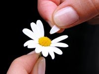
Because we re-filmed all our footage with different actors I had to take a different photo for use in my article, i also included a bit more of a spin into my article content and changed some of the interview question and answers.This is my almost final draft however i think i may need to re-align the writing on the left hand side as if it were to be in a magazine that has 2 side to it the very centre bit would be slightly squashed, this also points out a flaw in the design of the hearts, but if it was not a binded magazine and had for example two staples through the middles this would not be a problem and the design would be seen fine.


Tuesday, 16 February 2010

Filming

On the 16th February, Sarah and I met to re-film all of our footage as we decided that the lighting was not good enough and the focus of the camera also blurred quite a bit in the footage we had done previously.
Whilst trying to film we faced quite a few problems as when trying to film a bedroom window you could not see in it and it would have been a funny angle to have seen in from, it also meant trying to film through an open window which could have been dangerous, we also kept getting reflections on many of the windows but it would have been no use trying to film at night either and so used an inside window from an inside to film the female and an outside window for the male, this gives continuity errors but in the time constraint we had and the location we had to film we had to work with what we had.

We took some photos whilst filming,


We will upload all the footage when we are back in college, and if any adjustments are necessary arrange to re-film bits, hopefully we will be able to edit it all straight away.

Friday, 12 February 2010

Magazine article research/layout

In order to prepare for the magazine article I did some research into other article layouts and found these :


This article layout I liked because it uses a main picture of what it is about and uses very simple boxes to seperate the other pictures and text, it isn't about a film, however I thought it was a good double page spread design as the focus is on the place.

This double page spread if from an NME magazine, I like this because its obviously aimed at a younger generation, however I think it is quite cluttered and will take away some meaning to the love story article.

This article I have used because it is an example of how an interview can be set out, however this is using the interviewee in the pictures where as the article about my short film will be plugging the film through the pictures and design used rather than the director who I have interviewed.
I liked this article layout because its simple and effective the colours used add to the effect that it gives the reader and the uses of the bleakness draws you in to read the article unlike the NME layout that stood out and there was loads of things staring at you at once.
I picked this article because it was another idea for showing steps or the interview questions through the use of different background colours however its almost babyish in the cartoon use and colours used, so I still prefer the simpleness of the last design.
I then designed some ideas of my own to incorporate the hearts and the paper incorporating the idea from the signs for our article, this also ties into the poster design that Sarah has made which uses the colour Red obviously symbolic of love and the paper heart.

Instead of using the computer to make designs I decided to use my craft bits to come up with some ideas using paper and cutting out paper hearts these are what I came up with after I photographed them.


I prefer the first picture to the second as it is much simpler, the second I used confetti hearts but it makes it look a bit messy and also you can't actually tell there hearts so that idea would not have worked.


The first was if it was to be used as a single page but as it has to be a double page spread I changed the idea, however 2 of the single pages could have been put together but I don't think it would have been as effective, the second picture shows my final idea with the use of the confetti hearts as trails from the other paper hearts and little silver keys in the centre of the middle sized hearts to incorporate the idea of the key to the heart. I really like my idea but because i've done it on paper and it needs to be done electronically from the photograph i'm not sure how well it will work.

I also made a computerised version of my design to show the proposed layout.
I think this will be used as my article layout as it shows the use of the hearts and the paper well, and i edited the colour setting to also make it slightly pinker, however i may need to re-do it as this photograph was slightly blurred.

What makes a good short?

There are no hard - and - fast rules as to what makes a good short film but here are a few tips I found that may help us.

  • An exciting & original idea
  • A Strong Script
  • Good Acting
  • High Production Values
  • Make it Short
  • Strong Beginning
  • Avoid Repitition & Punch Line Twists
  • Exciting New Techniques & Styles
  • Other Resources
  • Related Guides
  • Help us improve the filmmaking Guide

Obviously there is an element of subjectivity in any short film as different exhibitors set their own criteria as to what they think makes a good short, which they feel their audiences will enjoy. In many ways it is an exciting time to be making shorts in the UK as there are a wealth of different festivals, screenings and organisations, websites and content providers looking for short films to exhibit.

Wednesday, 10 February 2010

Safety with Lighting/Risk Assessment

Here is a powerpoint I made to show the health and safety risks that must be taken into account when using lighting. It also includes the examples of how lighting can be used that we experimented with in lesson.


Before starting to film we were required to fill out risk assessment forms for all risks associated with filming in the location we had chosen.
Here is a photograph of our completed risk assessment form.


We had planned to film in the first few weeks of January but due to heavy snowfall we had to postpone it.

We worked out when all the members of our group were free and used a few media lessons to film some footage, however we were unable to use this footage as it was blurred and un-focused.

We then arranged to re-film on the Tuesday in the half term, where we unfortunately were let down last minute the night before by our actress and actor and also a member of our group.

So Sarah and I managed to find a new actor and actress and spent the day filming on set, but having to change a lot of the plans due to problems in filming on the sets we had initially planned to use and change of actor/actress meant we also had to re-shoot everything and get new pictures. We managed to do this on the day.

Wednesday, 3 February 2010

Storyboarding/Planning

We made two storyboards during planning our short film, the first was not very well drawn or detailed so we made another which has notes to accompany it.


Here are some photos of our storyboards also.

We also created a props and character list.
Props needed:
-Paper
-Pen/Permanent Marker
-Lipstick
-Key
-Ribbon
Characters:
Boy - Was to be Natasha's friend , instead played by Matthew Stebbings
Girl - Was to be Natasha, instead was Jade Louise Rogers
Location to be used is my dad's house just round the corner from college, as it is big and pretty much a blank canvas to use, unfortunately it wasn't as easy as we thought to film through windows.
Our script was very simple and was just what was written in the pitch, however when filming it was changed from a bedroom to a kitchen and instead of being laid on her bed she was washing up, etc, in order to help the story still fit with the change of filming set.

Film Posters

I did some research into film posters to look for ideas for our poster and this is what i found.


These pictures were taken to incorporate into the idea of the girl looking through the window with a key hole the shape of a heart, however we decided this idea would be too difficult to do.

With these posters there is recurring theme of the two characters being very close and intimate but in a sweet pose together i dont thnk this is the sort of film poster we are aiming for .


I then looked at some more romance film posters and we found these which will tie in with our ideas much better:
I liked the love actually poster as it is simple modern and incorporates the colours of love simply, obviously it was a feature length film though and the use of the hollywood actors and actresses names possibly won the audiences over in this case.
I liked this poster design as it showed the paper - as with the signs we would be using along with it almost being sewn together as could be the case as in our film the girl has turned the boy down before but tells him she loves him this time so is she mending his heart in that case...It is again simplistic and to the point with again colours denoting love a reddish colour.
I liked this poster as it was showing the sort of taking of the heart and the boy and girl in the shadows, it also has the colours associated with love however gives an idea of being more for teenagers and younger than a wide audience of 15-25 year olds as our film is.
After looking at some more film posters and trying out the designs we found it was going to look better and be easier to create if we made it simple by using just a heart and a key. As our filming did not go to plan either we had to get some new photos for the article which were included in there instead of the use of the 2 above that were initially going to be used in both.